

Los Angeles Fires : Palisades : Pepperdine

FLiGHTLiNES.CSV Coast
Commit 4a8760a
#elnino @RepKarenBass @RealHWAtlanta @realDonaldTrump @normani pic.twitter.com/JXuedfs2zJ
— ThakaSartu KellySelassie (@thakasartu) January 30, 2025


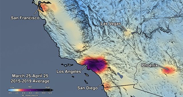
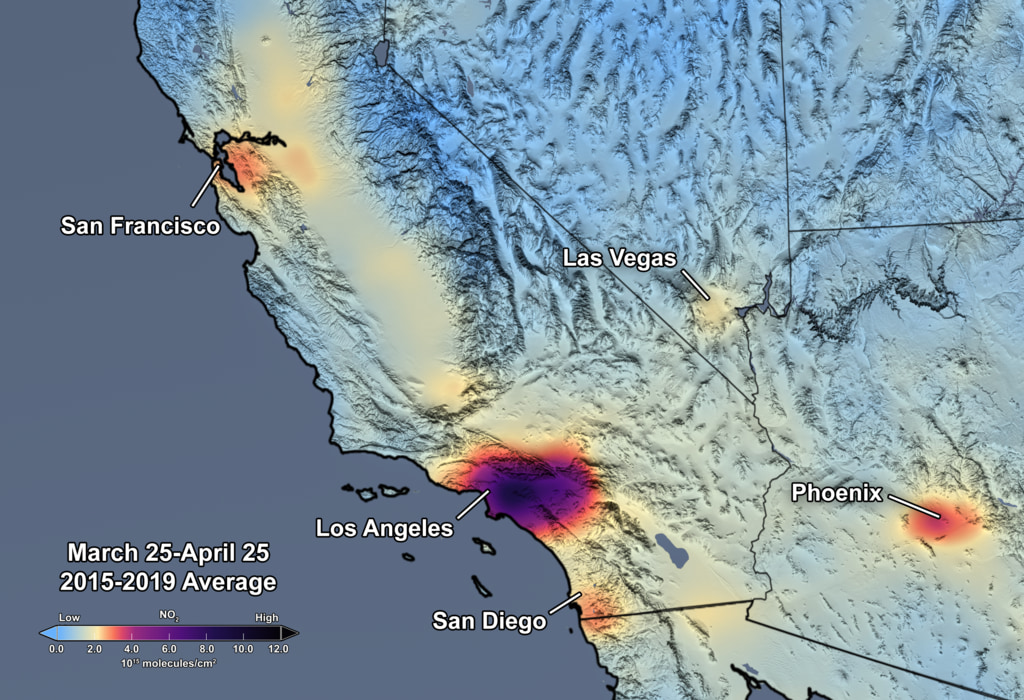
Nitrogen Dioxide over the Continental US and Los Angeles
Upon zooming into Southern California, finer details of pollution gradients are clearly visible over the Los Angeles/San Diego region. Here the concentration of NO2 is shown in shades of light blue to dark pink/purple indicating values ranging from low to high by CindyStarr Global Nitrogen Dioxide Monitoring Home Page @nasa @nasa-jpl @blackgirlscode @normani hi
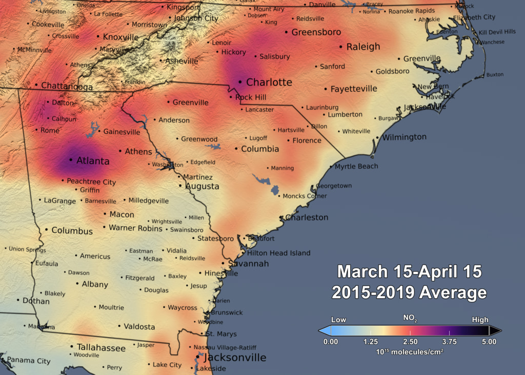
Reductions in Pollution Associated with Decreased Fossil Fuel Use Resulting from COVID-19 Mitigation
Released Friday, April 24, 2020
Written by: Bryan Duncan Over the past several weeks, the United States has seen significant reductions in air pollution over its major metropolitan areas. Similar reductions in air pollution have been observed in other regions of the world. READMORE Released Friday, April 24, 2020


GRACE and GRACE-FO track California’s land water changes
NASA’s Gravity Recovery and Climate Experiment (GRACE, 2002 - 2017) mission, and its successor GRACE Follow-On (launched in 2018), map month-to-month changes in Earth’s gravity field resulting from the movement of mass, such as water, near the surface of the planet. This animation shows how the total amount of water (snow, surface water, soil moisture, and groundwater) varies in space and time, with the passage of dry seasons and wet seasons as well as with flooding, drought, and transport due to water management. Blue colors represent wetter than average conditions (relative to 2004-2010), while red colors represent drier than average conditions. The yellow line in the graph on the left shows the evolution of the long-term inter-annual variations for the area outlined in yellow on the map (note: the average seasonal cycle has been removed).
The Sacramento and San Joaquin River basins are outlined in yellow, and rivers and tributaries are shown as blue lines. The basins include California’s Central Valley, the most productive agricultural region in the U.S. Repeated drought conditions and increased water use in California have led to a long-term decline of terrestrial water, interspersed with above-average precipitation periods (e.g., 2015/2016, 2022/2023) that have allowed some recovery of the land water storage.
Credit NASA / JPL
Science On a Sphere: 4 Years of Biosphere
RelatedTweet
By monitoring the color of reflected light via satellite, scientists can determine how successfully plant life is photosynthesizing. A measurement of photosynthesis is essentially a measurement of successful growth, and growth means successful use of ambient carbon. This data visualization represents four years’ worth of data taken primarily by Suomi NPP/VIIRS satellite sensors, showing the abundance of life both on land and in the seaREADMORE


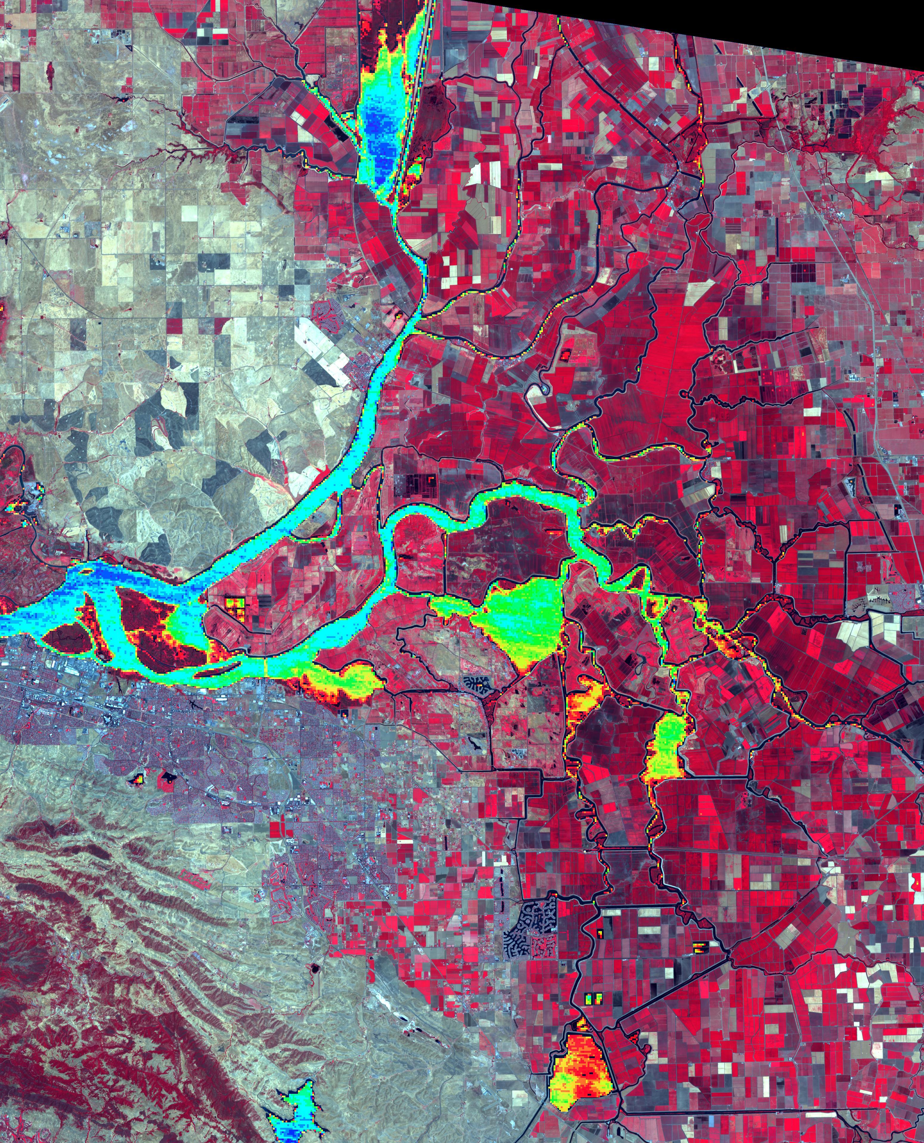
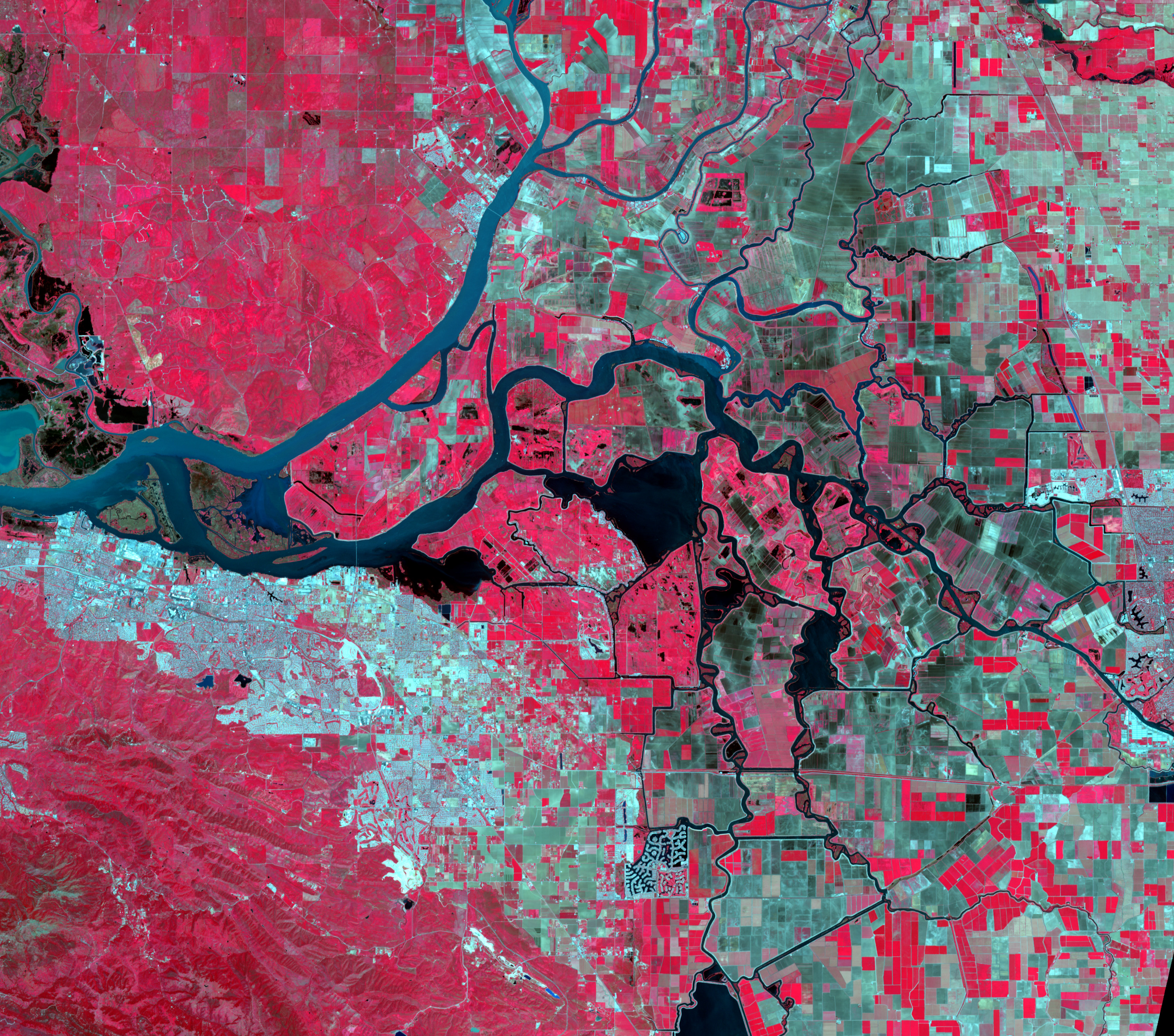
Levee Break Floods Central California

Gavin NEwsome
I left a tweet on your housefloor meeting
@usepa @nasa-jpl @usgs
EPA + WATER MAPS
NASA WORLDViEW Mar12 USGS WATERDASHBOARD Mar12

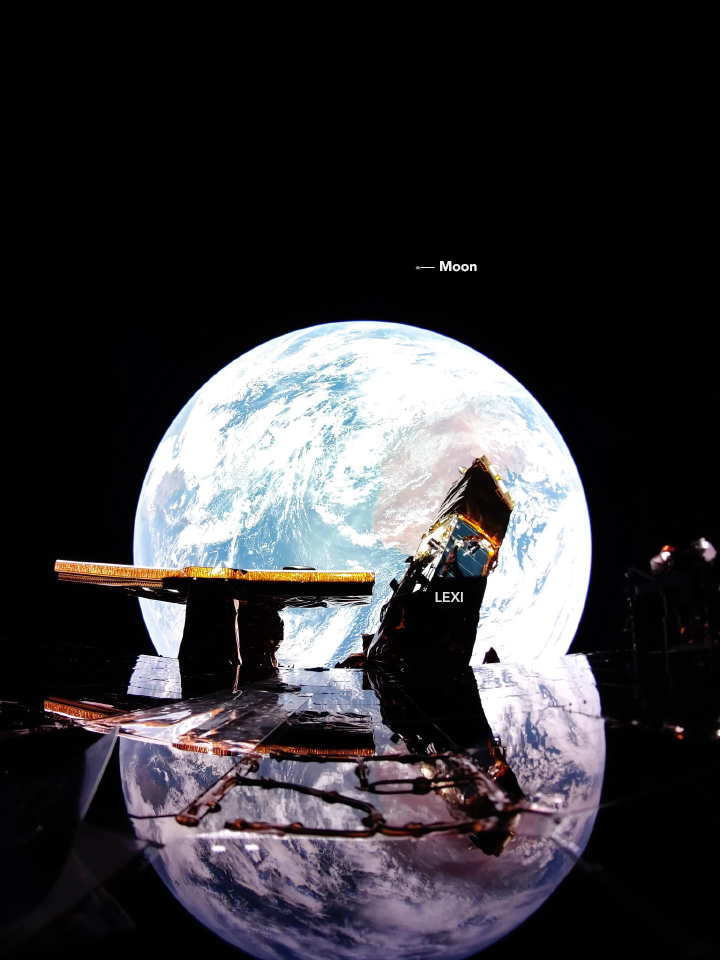
A Small Blue-Gray Marble
A digital camera on the Blue Ghost lander looked back at Earth and captured this ethereal image. - NASA VisiBLEEARTH FireFlyAeroSpace
